Branding

Branding

Web Design

Web Design

Complete re-brand and website for one of the Slovakia's most lucrative law firms

Complete
re-brand and website for one of the Slovakia's most lucrative law firms

Client

Poláček & Partners

Industry

Law firm

Country

🇸🇰 Slovakia

Year

2023 - 2024

Duration

4 mos

Services provided

Logo Design
Visual Identity
UX/UI Design
Web Design

About project

About project

This is how I helped the client overcome their challenges

This is how I helped the client overcome their challenges

This is how I helped the client overcome their challenges

The client

P&P is a renowned law firm based in Bratislava, Slovakia. They are well-known for their expertise and successful law cases, but most of all, they are known for their human approach. As they like to say, "We translate legalese into simple human language."

The client

P&P is a renowned law firm based in Bratislava, Slovakia. They are well-known for their expertise and successful law cases, but most of all, they are known for their human approach. As they like to say, "We translate legalese into simple human language."

The client

P&P is a renowned law firm based in Bratislava, Slovakia. They are well-known for their expertise and successful law cases, but most of all, they are known for their human approach. As they like to say, "We translate legalese into simple human language."

The challenge

My team's task was to differentiate P&P from their otherwise monotone, serious and very formal competition, and communicate their unique characteristic "human approach" not only in written word but also visually.

The challenge

My team's task was to differentiate P&P from their otherwise monotone, serious and very formal competition, and communicate their unique characteristic "human approach" not only in written word but also visually.

The challenge

My team's task was to differentiate P&P from their otherwise monotone, serious and very formal competition, and communicate their unique characteristic "human approach" not only in written word but also visually.

The solution

We developed a distinctive visual identity and website that reinforced P&P's character and solidified its unique market position, setting it successfully apart from their competitors. Now customers could see their human approach in their visual communication instead of just hearing about it.

Logo Design

Logo Design

Clean logo mark ready for any space and environment,
digital or real.

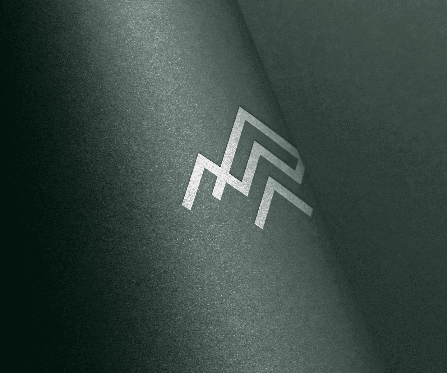
We designed a simple and modern wordmark, which will endure over time. To make the whole logo system more versatile, we combined it with a simple mark of overlapping ‘P’ letters, which is perfect for use in digital, but also real-world applications.

Visual Elements

The brand identity is built around three key elements that emphasize its human essence:

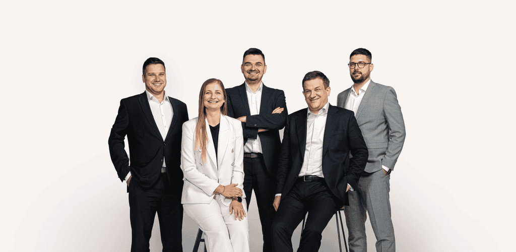
First, our warm-toned, detailed photography captures genuine human emotions.

Second, we incorporate hand-drawn elements to bring an authentic, personal touch.

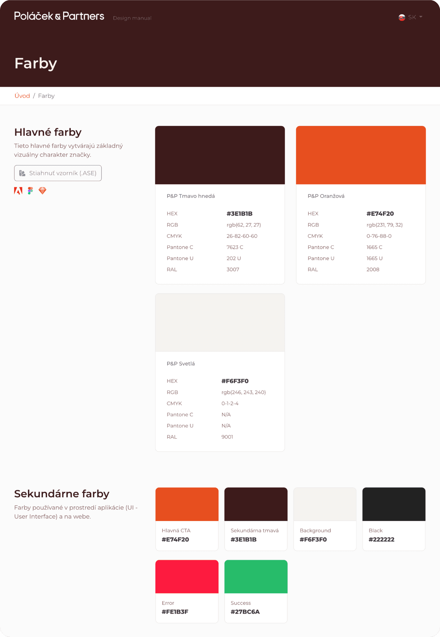
Finally, our color palette is inspired by natural skin tones, creating a sense of warmth and connection. Orange accents add energy and vibrancy to the brand.

Color palette with approachability and human touch

The color palette effectively distinguishes P&P from their competitors and sets a unique tone in an otherwise monotone and formal industry.

Marketing Collateral

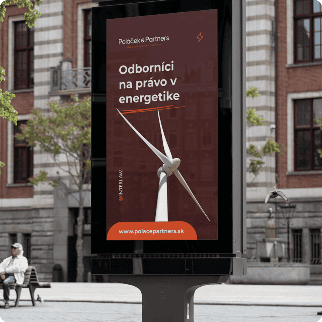
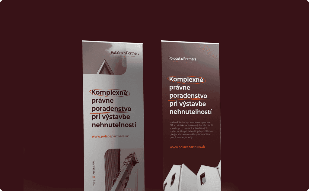
We created multiple 3D visualizations of relevant marketing materials and touchpoints, which helped the client imagine their new brand in both real and digital environments.

Website

Website

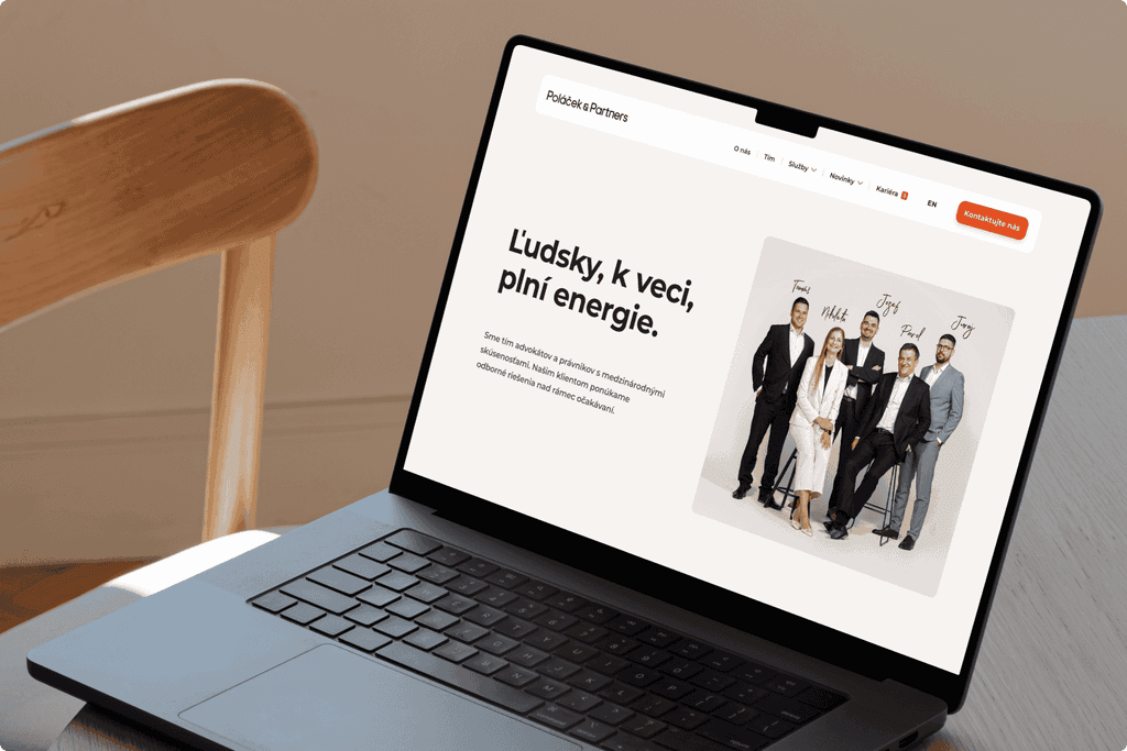
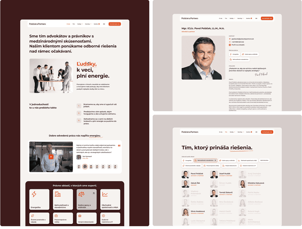
Website which is not only intuitive to use but also represents the P&P brand perfectly

45 %

Increased the number of page views per user

< 1.5 sec.

Optimized the whole site's load time

1 → 3 min

Enhanced average session duration

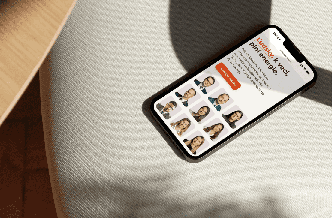
Mobile optimization

Perfectly optimized for devices of all sizes to ensure the best possible user experience.

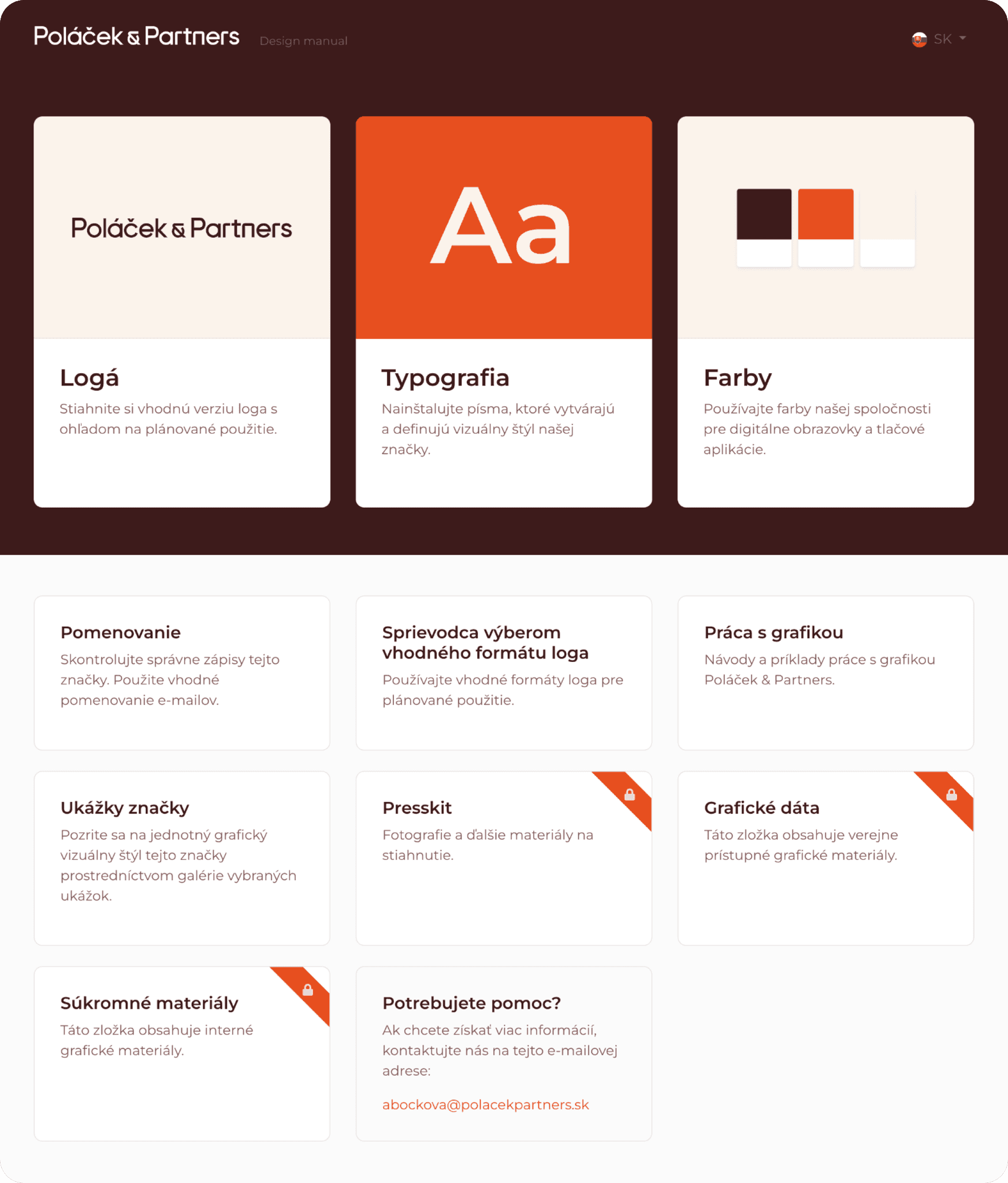
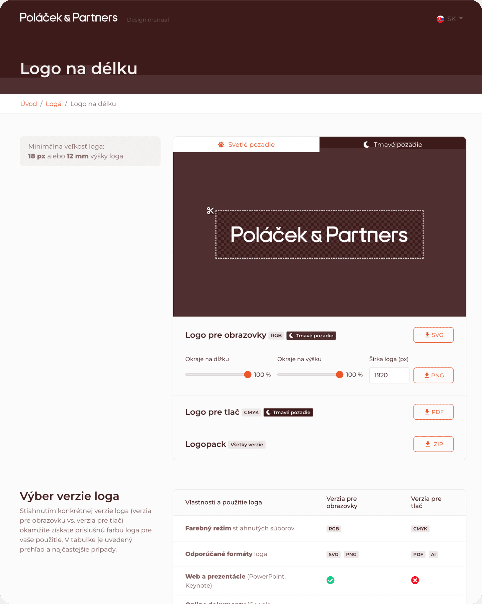
One easily accessible online place to store all the brand assets

We culminated all the brand assets in one online place that the client can easily access at all times. This not only helps the brand remain consistent across all touchpoints but also makes it easier to maintain, as all assets are stored in the cloud, providing a single source of truth.

Credits

Credits

Internal team

Brand Design: Samuel Mucha, Jakub Had

UX/UI Design: Jakub Had

External team

Strategy: Restartup (Michal Novota & Ivan Luba)

Photography: Hilight studio (Lenka Imrichová)

Available for Work

Ready to level up your brand or web?

  • Get in Touch -

Available for Work

Ready to level up your brand or web?

  • Get in Touch -

Available for Work

Ready to level up your brand or web?

  • Get in Touch -