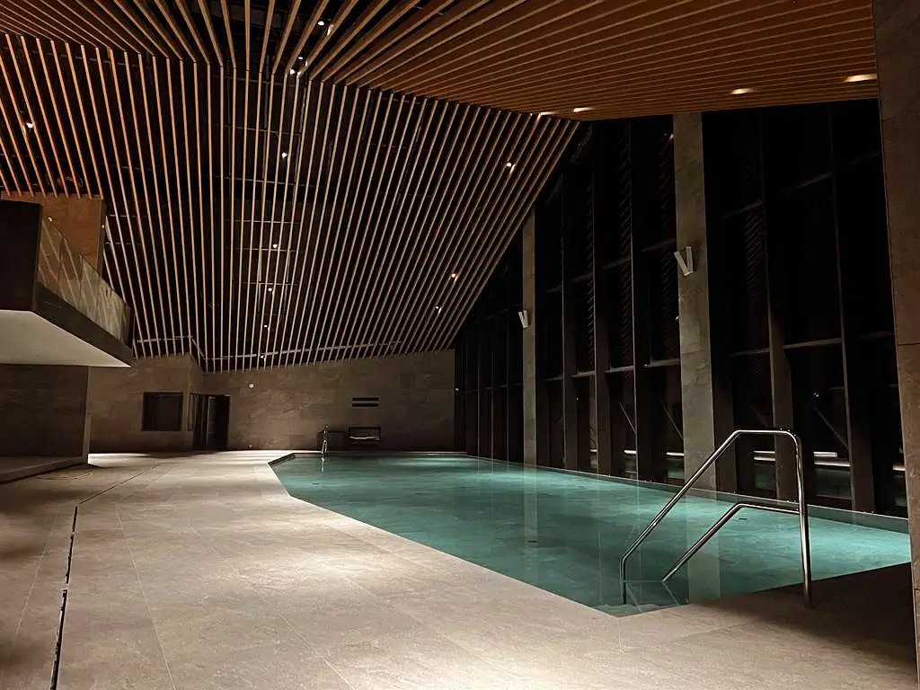
Brand for one of the biggest and most luxurious mountain resorts in Europe
Client
Damian Jasna
Industry
Hotel & Resort
Country
🇸🇰 Slovakia
Year
2022
Duration
2 mos
Services provided
Brand strategy
Logo design
Visual identity design
Communication
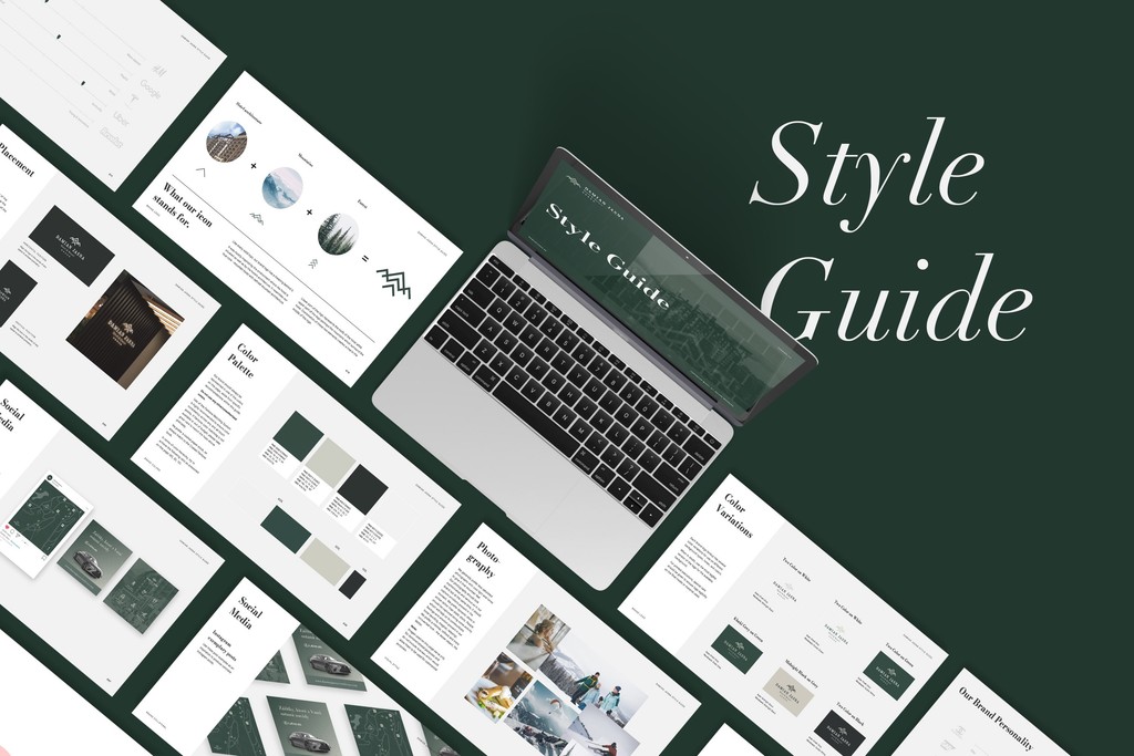
Brand guidelines
Marketing collateral design
In a category where everyone is going for the obvious, we took the turn in the opposite direction.
Our aim was to set the brand apart from the conventional style and obvious luxury typically associated with our competitors.
Unique position
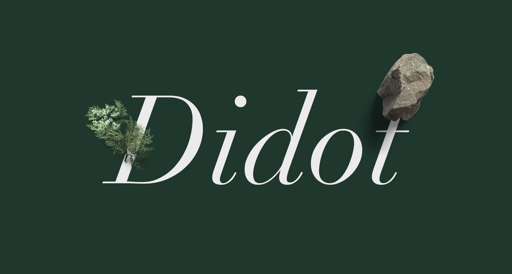
I created a distinct brand identity in which I married mountain environment with a minimalistic premium style. I aimed for a luxurious look without being too flashy. Instead, I based the whole design system on the idea: “less is more”.
Design direction
Expressive, ornamental and flashy was replaced with clean, refined and sophisticated. The result? New brand identity defined by simplicity, lot of negative space communicating abundance, and clean layouts to evoke the feeling of sophistication.
Simple yet elegant
Logo design
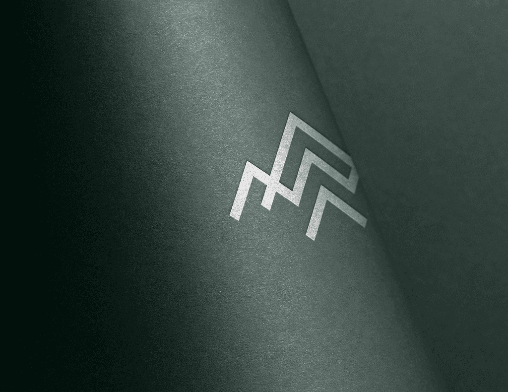
For the logo, I chose an abstract mark to communicate the brand’s serious and refined character. But I still wanted it to be evocative.
So I decided that shapes of the logo should be inspired not only by the hotel’s architectural features but also its environment. The result is a simple mark that works in any environment.
Visual Identity
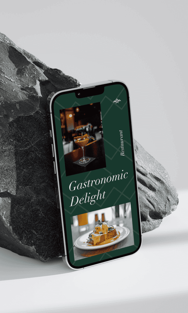
Identity inspired by its environment and architecture. Different from competitors. Unique in its segment.
Marketing Collateral
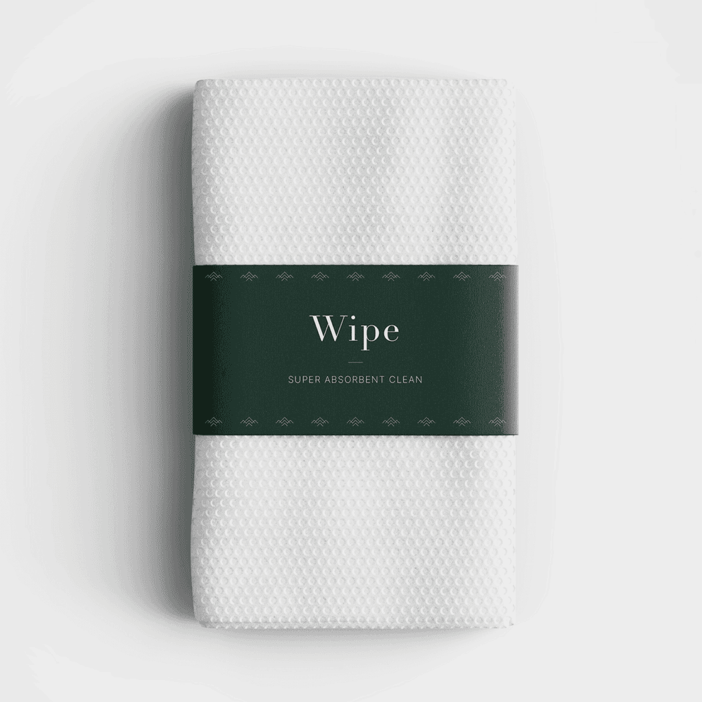
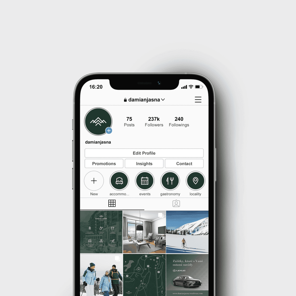
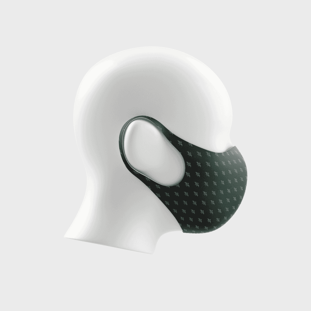
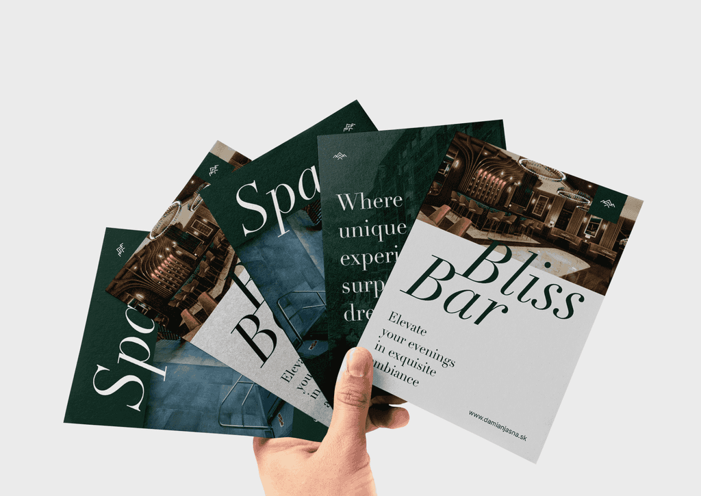
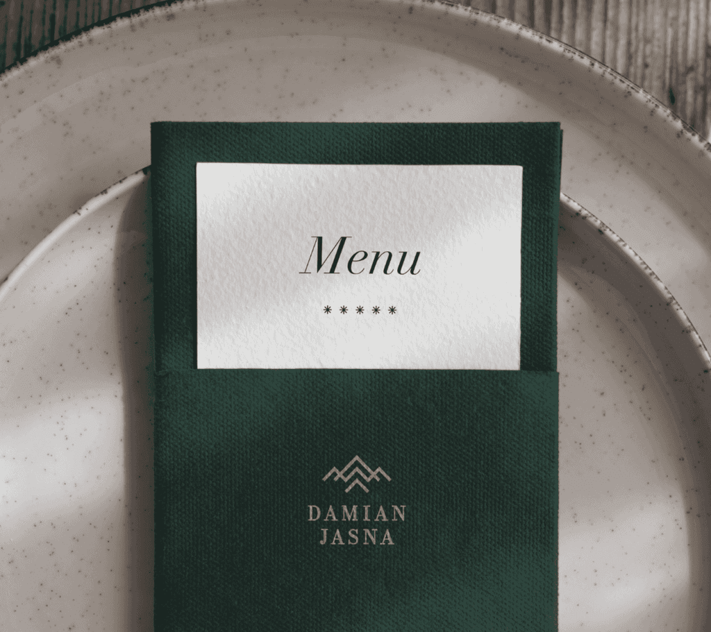
Everything from business cards to hotel merchandise and social media design.
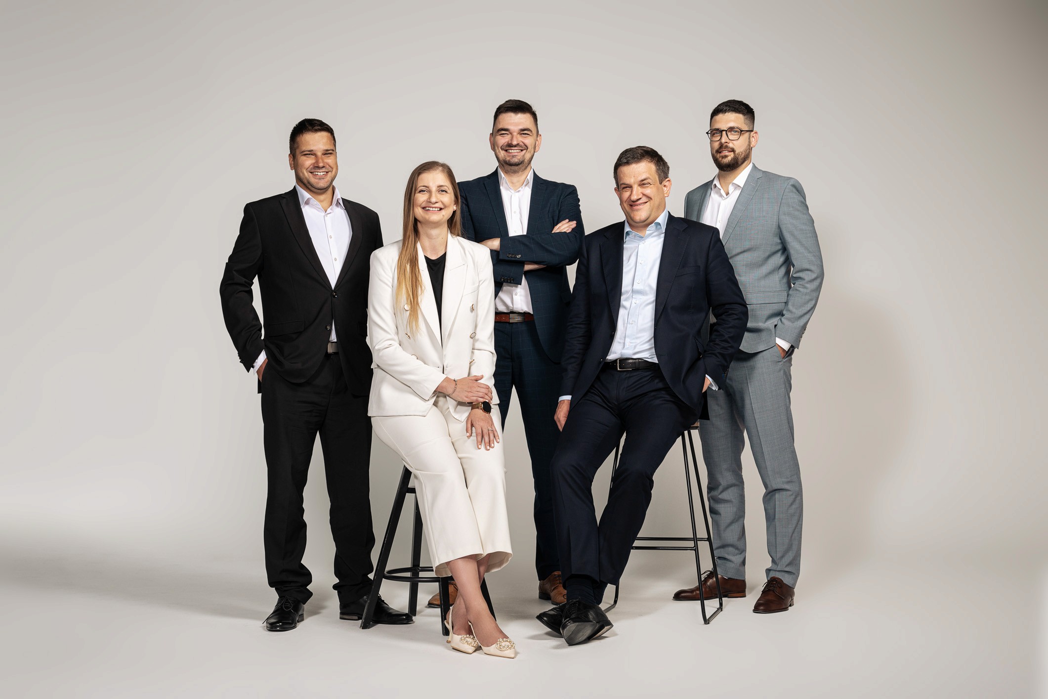
Internal team
Brand Design: Samuel Mucha


